This action will delete this post on this instance and on all federated instances, and it cannot be undone. Are you certain you want to delete this post?

JayVii posted May 28, 2025
Yesterday, I implemented #CSS rules in my "purpleish theme" within my #ktistec tweaks that change the display of posts in card style, similar to other social media. Also adds some very subtle shadow, which gives it a very slight 3D effect. This looks a lot more modern now, I think: https://src.jayvii.de/pub/ktistec-tweaks/commit/136cc0629bd23df71cc4969e23e6c252f847a9c6.html
JayVii posted Oct 3, 2024
I finally uploaded the #CSS rules for the #selfoss #mobile tweaks: https://src.jayvii.de/pub/selfoss-tweaks/file/css/mobile.css.html
JayVii posted Aug 8, 2024
I am actually really happy about how my mobile-tweaks for #ktistec turned out. There was a lot of #CSS hacking involved, but I am pretty happy with the results :)
Here's a little video of how it looks:
JayVii posted Jul 30, 2024
I finally transferred almost all my webtools to SimpleCSS, for example the #goaccess dashboard for privacy preserving web traffic measurements:
https://src.jayvii.de/pub/goaccess_dashboard/ (see it in action here: traffic.jayvii.de
Or other tools such as a barebones youtube-feed yt2html, twitch-feed tw2html, youtube-to-podcatcher service yt2rss, ...
I really like the idea of simple and classless #CSS. It helped me improve the visuals of my #PHP services quite a lot!
JayVii posted Jul 20, 2024
JayVii posted Jul 15, 2024
Started working on some tiny #ktistec end-user hacks: https://src.jayvii.de/pub/ktistec-tweaks
For now only a user #CSS theme i dupped "purple-ish": https://src.jayvii.de/pub/ktistec-tweaks/file/css/purpleish.css.html
Maybe more to come in the future. Or not, we'll see :)
JayVii posted Jun 9, 2024
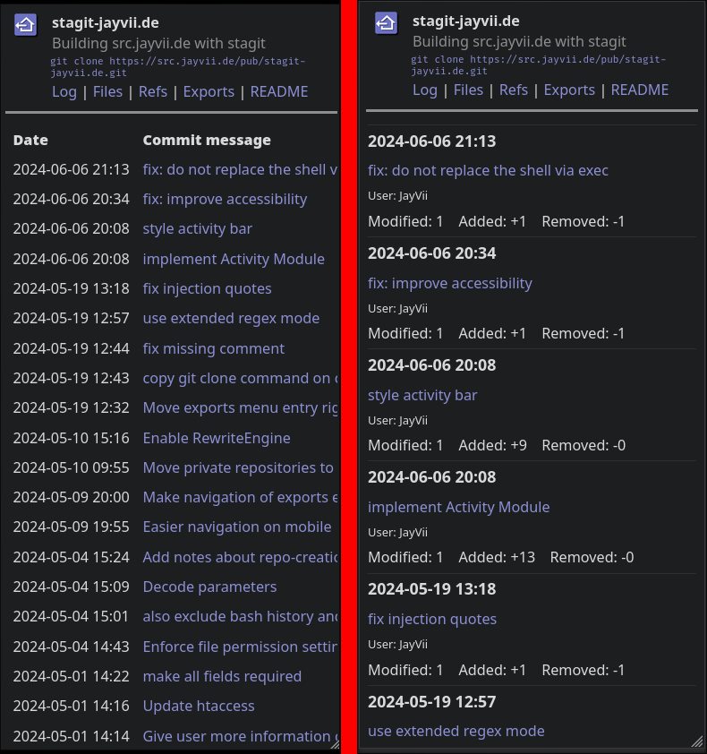
My extension & adaptation quest of #stagit goes on next week! I implemented basic functionality that automate mosts common tasks a while back already. Implemented dynamic #CSS themes earlier this year and a more modern look in the past week (as well as a summary page for every repository). Next week, I want to bring the menu bar to a more modern design:
JayVii posted Jun 8, 2024
Did some more #CSS hacking on my #stagit server: src.jayvii.de #git #selfhosting
The table-layout scheme used by stagit is simplistic and gives a great quick overview over repos, commits, etc. But it just doesn't work well on mobile devices and looks awfully outdated.
So I reform the tables to a more modern GitLab-inspired look just with a few lines of CSS.
Here are a few before and after screenshots: